Company Background:
PSI Foundation is a physician-sponsored granting agency that provides over 4 million dollars of funding annually to physicians and student residents across Ontario.
Key Project Highlights:
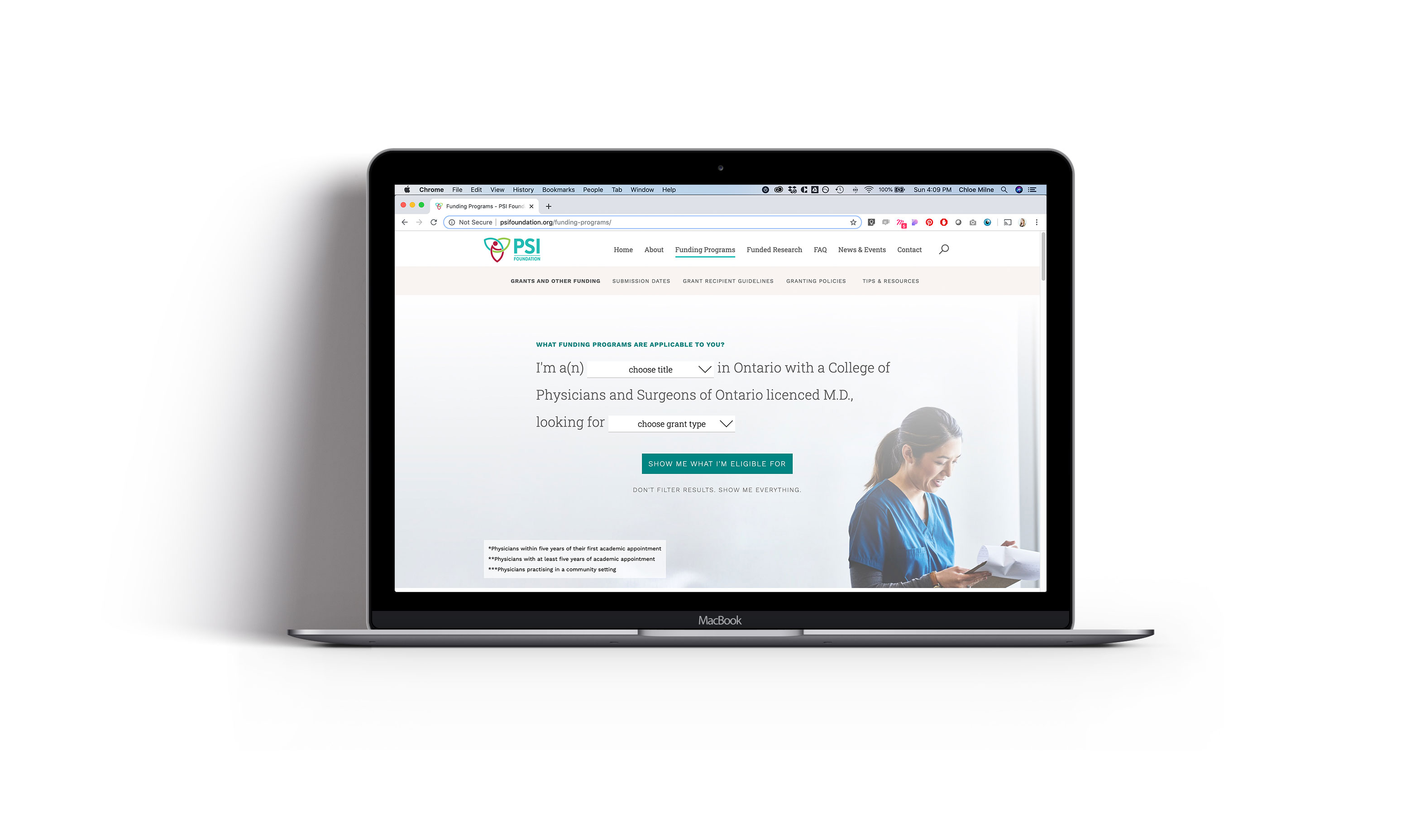
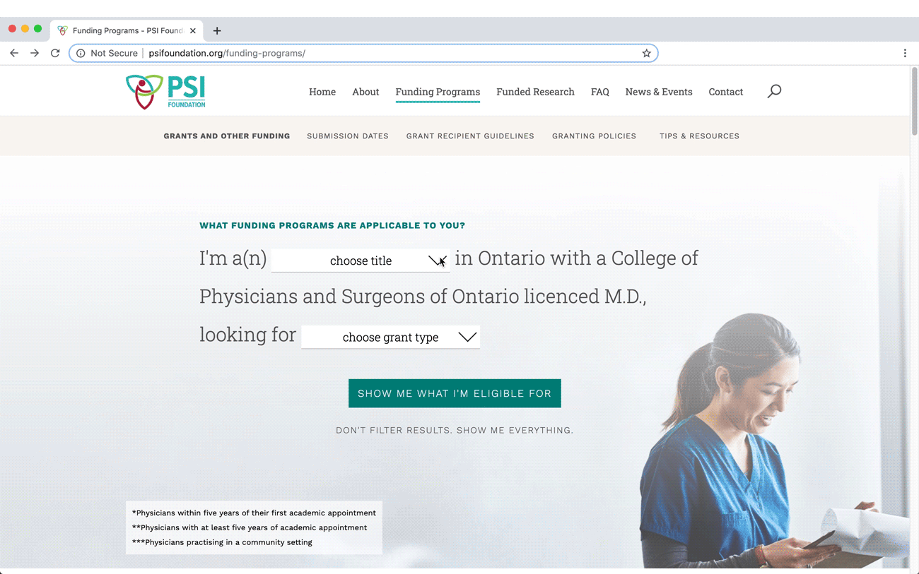
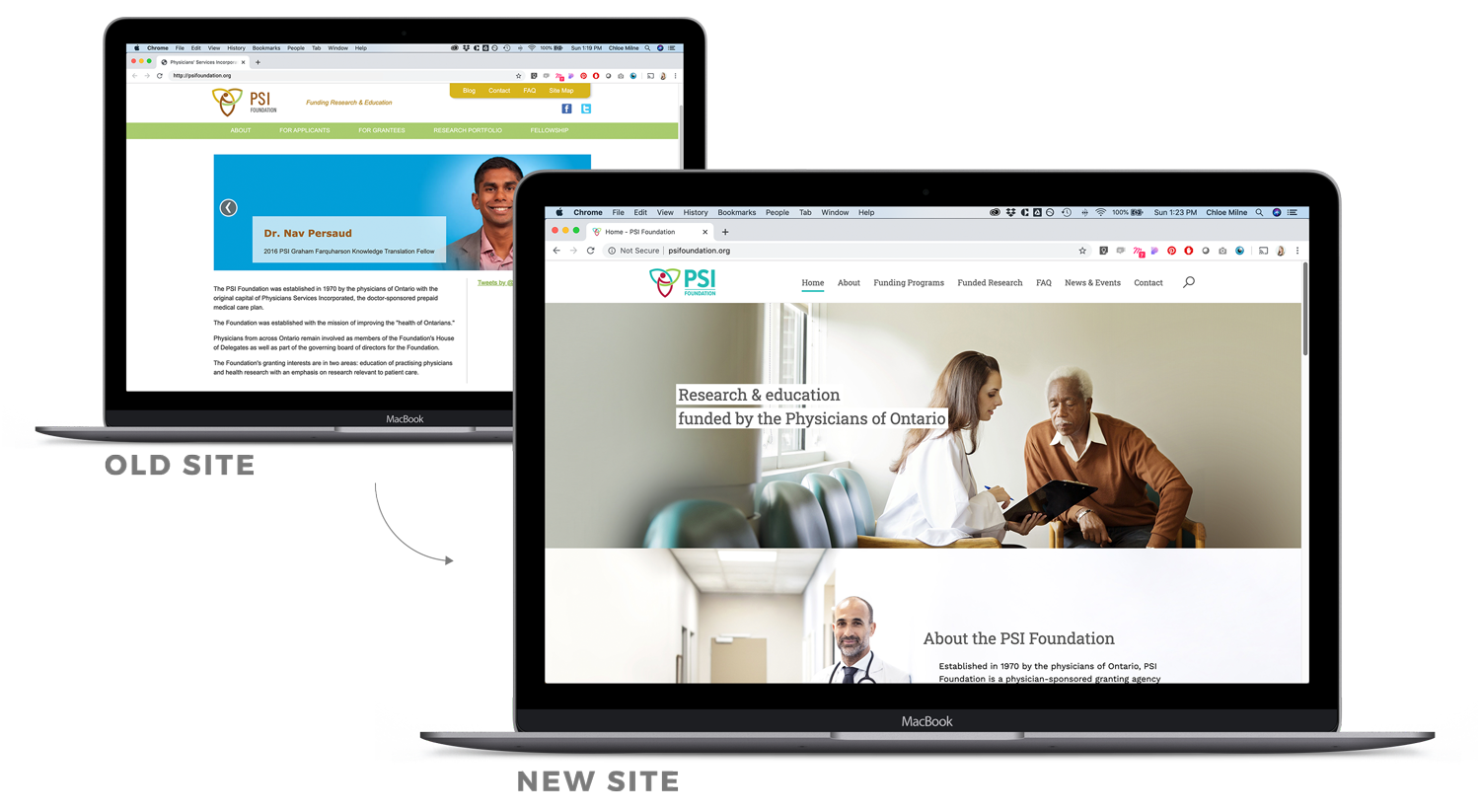
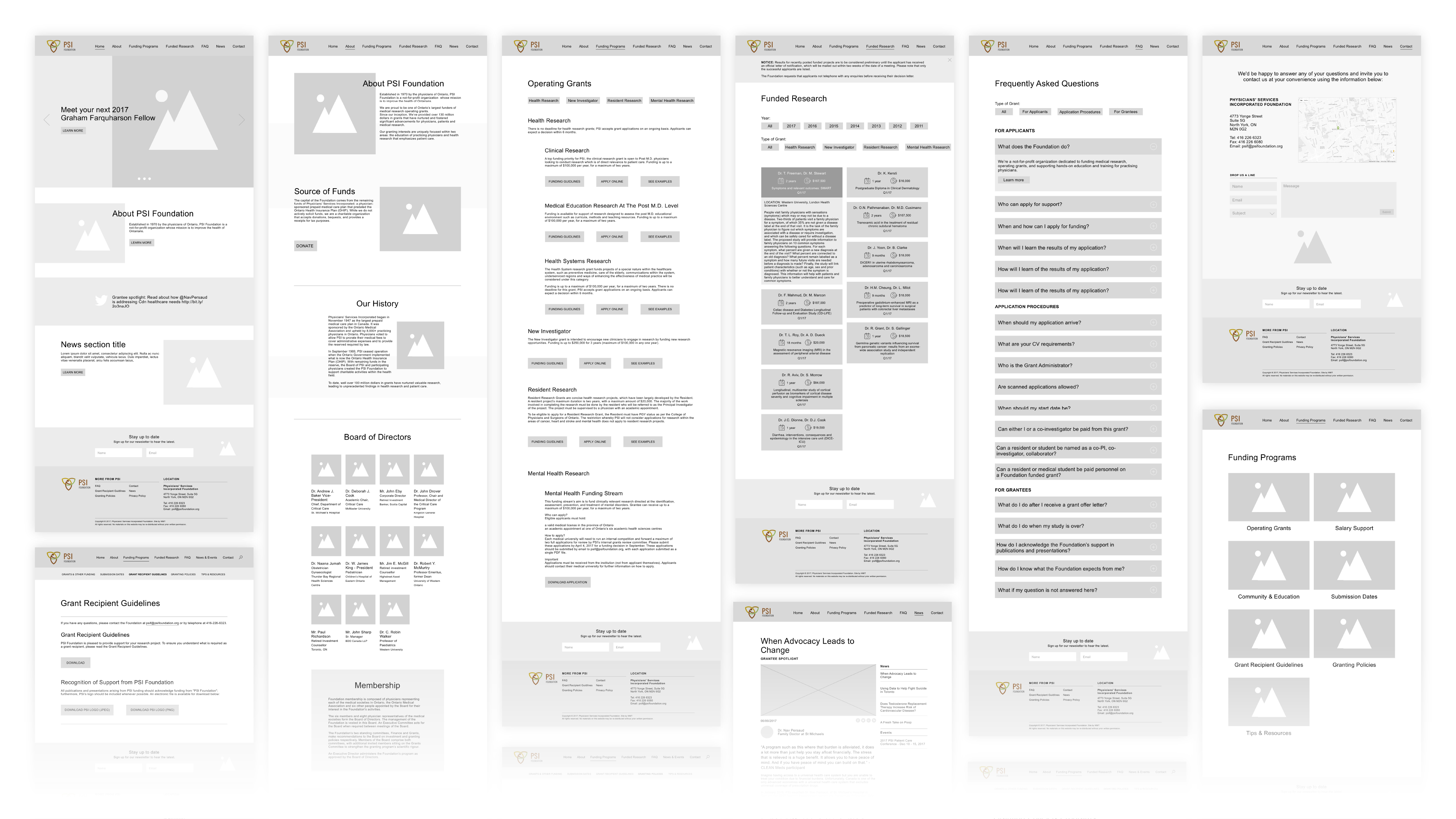
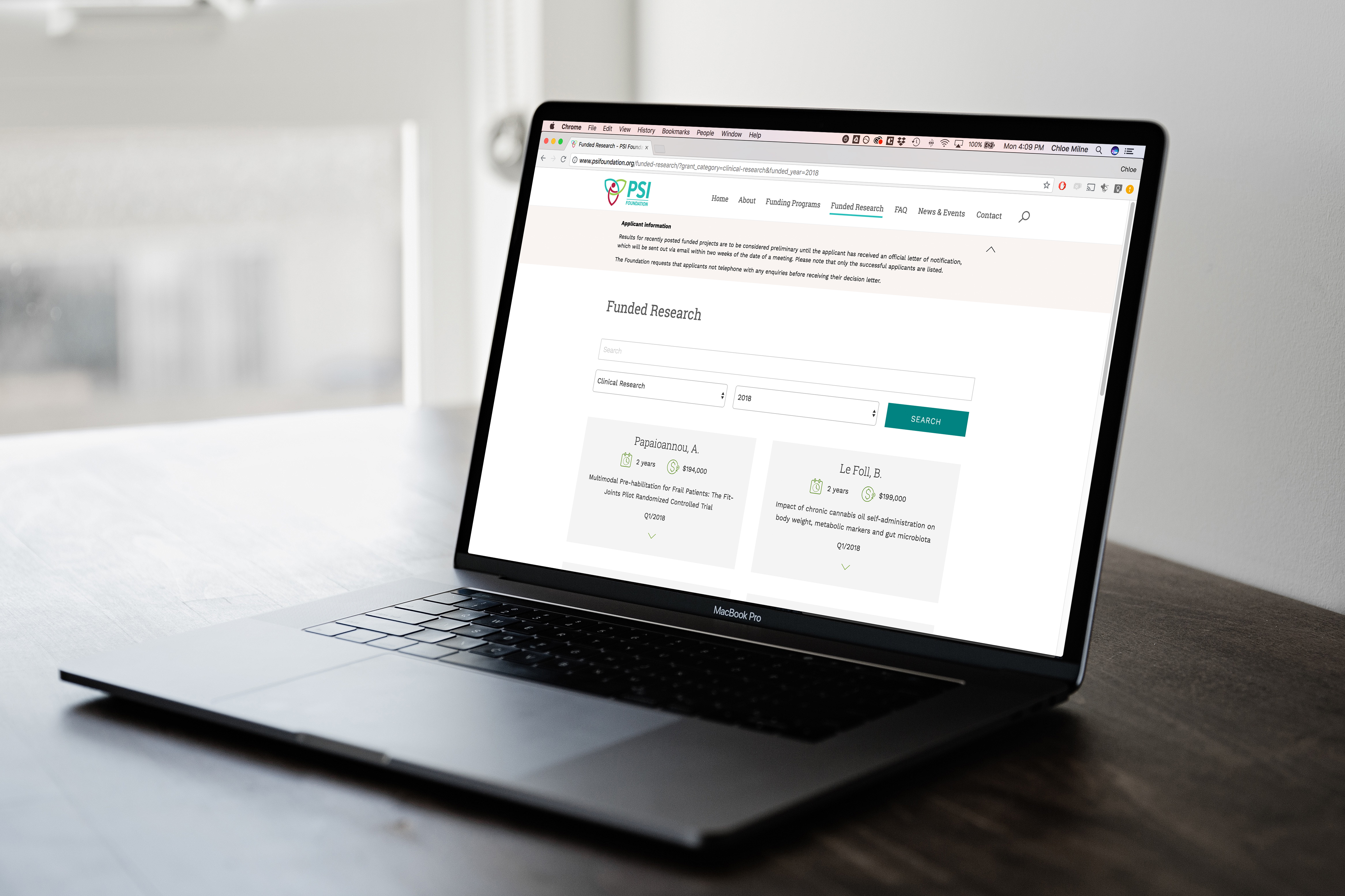
With a goal of improving the user experience and cutting down on phone calls, we redesigned the PSI website and created a natural language filter to help grantees quickly understand what they’re eligible to apply to, how to do so and examples of each grant type from previous years. In doing so, we also created an online archive of their funded research projects. This website was also designed and developed to meet WCAG AA compliance. We also refreshed their branding and some messaging to reflect PSI’s goals.
Project Details:
The foundation recognized that communication with key audiences like grantees needed improvement and reached out to explore solutions. After a number of discussions with PSI we understood that their website is a central hub for key information and decided that the most impactful improvement to their audience’s user experience would be restructuring and redesigning their website to make it more user friendly. At the time, their website had a very complex, confusing information structure and didn’t do a great job of helping future grantees understand exactly what they were eligible for, when to apply, or how to navigate previously funded research, etc. The client found there were numerous phone calls requesting information that already existed on website.
Usability:
To streamline the grantee's experience and help them quickly understand the types of grants they're eligible to apply for, a natural language filter was implemented and accompanied by clear prompts. While looking at the details of the grants available, they also have the opportunity to see previously funded research projects for that particular grant. In addition to this, the new website was also designed and developed to meet WCAG AA compliance. A few of the most significant adjustments included making the grant eligibility requirements as simple and easy to understand as possible, and renaming and reorganizing the previously funded research into a searchable archive for grantees to use as a resource when applying, giving them real-world examples and reducing the number of phone calls.
Process:
This process started with examining the current information architecture and brand assets. Since it was so confusing, it was clear that the next step would be re-evaluating its structure to create something that was organized to make more sense. Reevaluating and adjusting the language was also part of this stage. A few of the most significant adjustments included making the grant eligibility requirements as simple and easy to understand as possible, and renaming and reorganizing the previously funded research into a searchable archive for grantees to use as a resource when applying.
Brand Adjustments:
Looking at the colour palette and logo, it was clear it was time for an update to reflect this simplified new communicative direction. New brand visuals including an updated logo, colour palette, typefaces and image styles were developed to modernize and reflect PSI’s new direction.
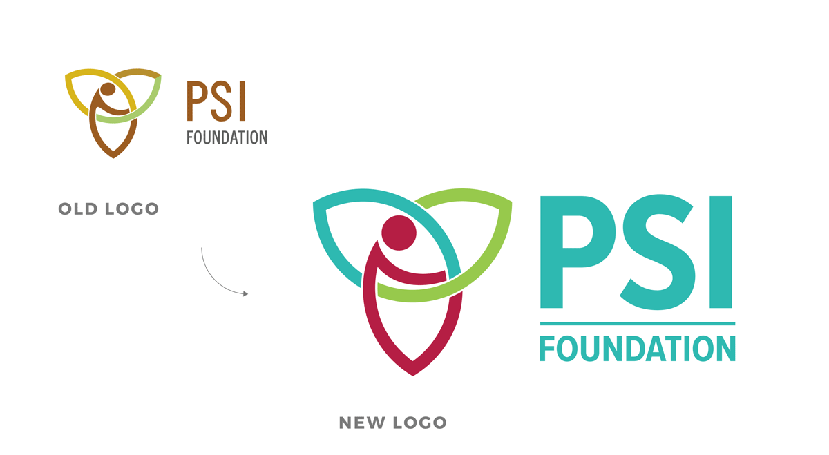
Specific adjustments to the logo include rounding out the “head” and the “arm”, simplifying the number of colours used, and balancing the typography.
Results:
Since the launch of this project in 2018, there has been an increase in grant applications, proving that better messaging combined with a significantly improved online experience can produce great results. PSI has also reported spending less time taking phone calls answering questions that are now easily found and answered on the website.