We Make Things—also known as WMT—is a brand strategy agency based in Toronto. WMT strives for clear brand communication, intriguing creative execution and most importantly, to create functional, usable solutions that address user problems.
I’ve been working with WMT for almost five years now and completed a number of internal projects. Joining while the company was brand* new, the first project was to create a brand. The brief called for brand visuals that were unique yet subtle enough to allow the agency's client work to be the star of the show.
*Pun intended.
As the only full-time designer on staff, I had the opportunity to lead discussions about the brand and its purpose to help shape the business. Through numerous discussions and brand exercises with the two co-founders and other designers, we uncovered that the heart of this brand is a desire to serve the client by focusing on the end user, clarifying communications and of course doing so with a little personality.
Logo
After a few more brand exercises, research, rough sketches and ideation, we landed on the use of Morse code as a visual reference. This became a fitting and multi-layered rationale, as the metaphor is two-fold; One, it shows simplicity in communication in multiple ways (visual and auditory). Two, Morse code itself—whether communicated visually as dashes and dots or in some cases flashes of light—can be seen as a reference to sacred geometry, as a dot (a point) and a dash (two points connected to create a line) is representative of the first steps in creating any form. It is a visual representation of simplicity at its most simple, visual form.
Using this as the core of the visual identity, we explored various executions, always asking “Does this resonate with our audience?”, “Is this the most simple way we can communicate this?” and of course, “Is it clever or interesting?”
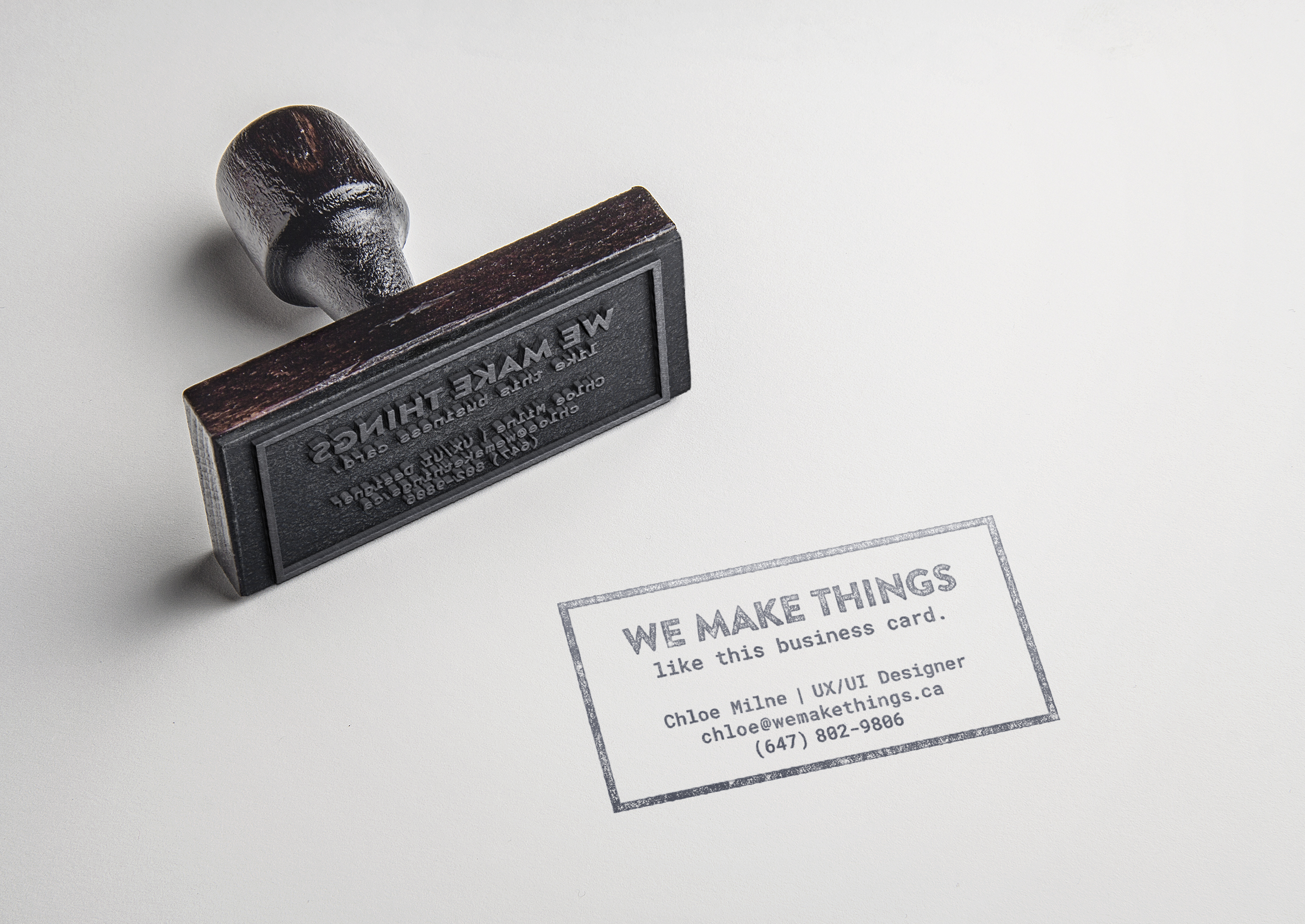
Business Cards
We played with many creative ways to communicate WMT’s brand purpose. A good example of this is our stamp business cards. When we’re networking, we whip it out, stamp anything in sight—a napkin, for example—and effectively turn our “calling card” into an example of what we do.. make things! It has had a lasting impression on those we’ve met and shown that creative touches help you go the extra mile in communicating effectively.
Websites
Currently, a more comprehensive agency website is being developed. At this stage, we’ve recently finished some initial target market research with our research partners and are analyzing the results to inform our business strategies and design decisions. This qualitative research mapped the customer journey’s of a number of high-level marketing executives at established brands. Through a series of moderated, written Q&As, we learned a lot about their experiences. They were asked to recall their experience in recently engaging and partnering with a new creative agency. Our goal was to understand the pivotal decision-making moments in their journey, how important various aspects of an agency’s brand is (if at all), if things like word of mouth recommendations was an important channel to consider, and more, all with the goal of understanding how we might create an opportunity to get on their radar. I’m unable to disclose the details of our findings, but even accounting for a little unconscious bias, it was certainly enlightening!
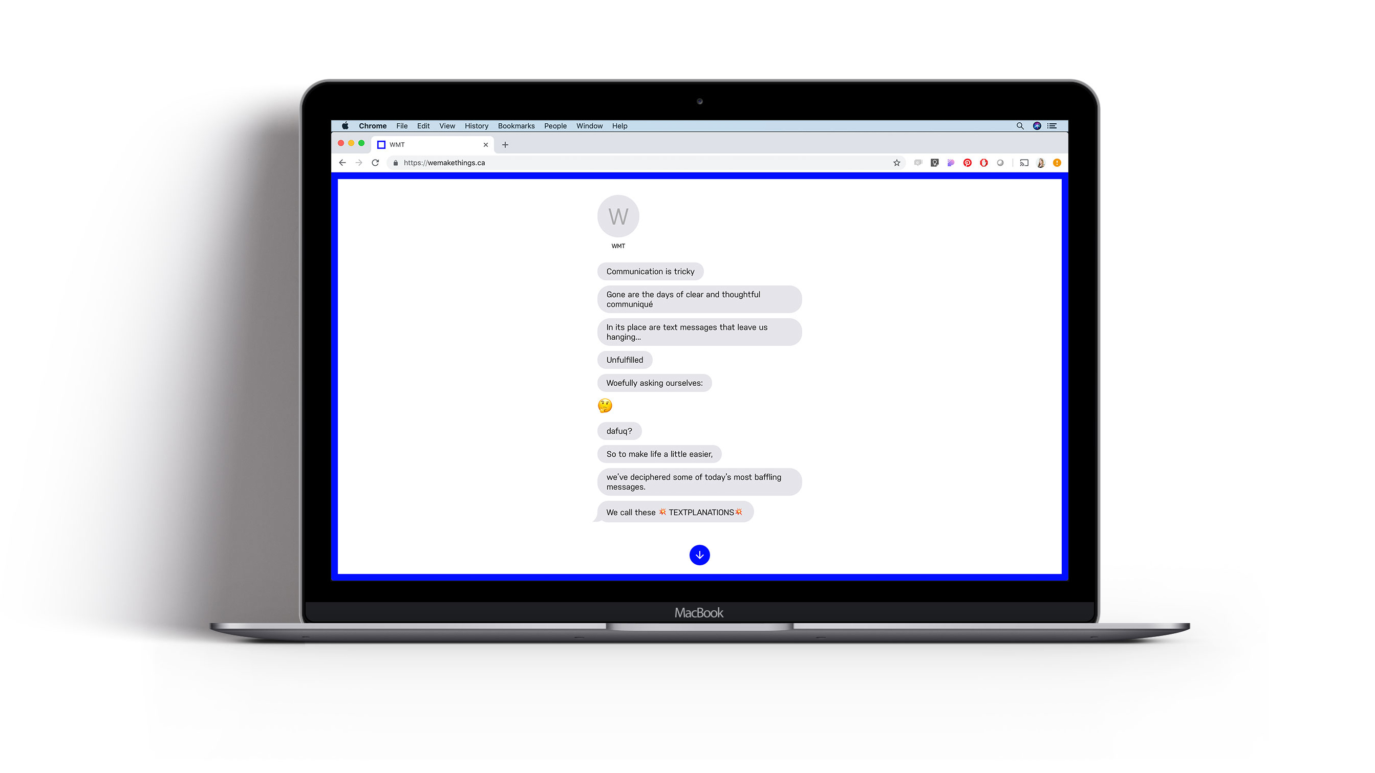
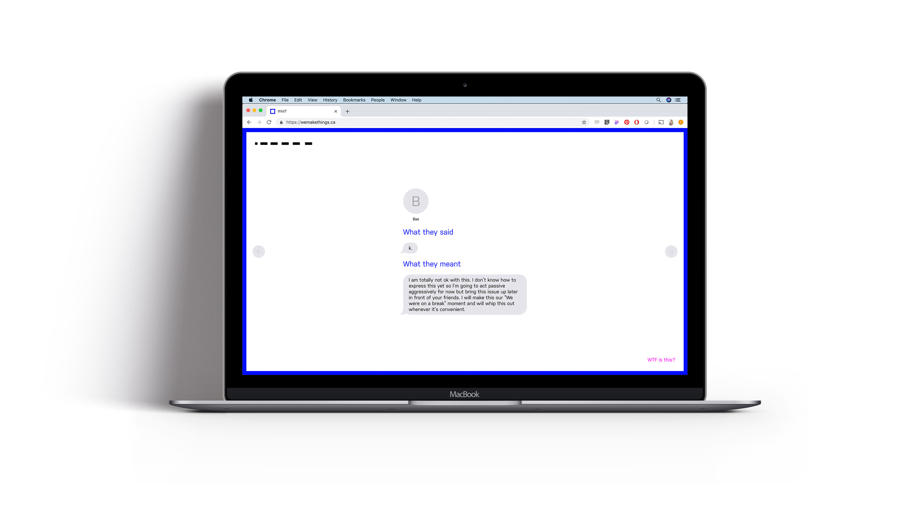
While the research was underway, we created a satirical microsite to help people decipher today's common miscommunications via text messages. It’s partly a joke, and partly a very simplified, loose metaphor of what we can do with market analysis and user data to help our clients.
In addition to the satirical microsite, we also created a private, hidden website we call our “pitch” website to use for future business. We recognized that our offering is anything but typical and we started to question why an a-typical digital agency would send over a generic, typical “pitch deck” in their usual formats (PDF or some sort of presentation deck). Knowing that time is key when responding to an RFP, an intro email that asks what we’re all about, or a follow up from a networking opportunity, we developed a way to quickly respond with an impressive, and most importantly, personalized touch. This site was designed with customizability and speed in mind, so I started by wireframing a dozen modular content blocks. I collaborated closely with the developer to bring this idea to life and ensure it was reasonable and feasible.
The best part is, no two sites are ever the same. We’re able to adjust the visuals to reflect their brand, include personalized messages, and sign-offs, hand pick case studies we think might be relevant to our potential client and encourage them to start the conversation with us. The initial data and results on the success of this site are still being collected and analyzed.
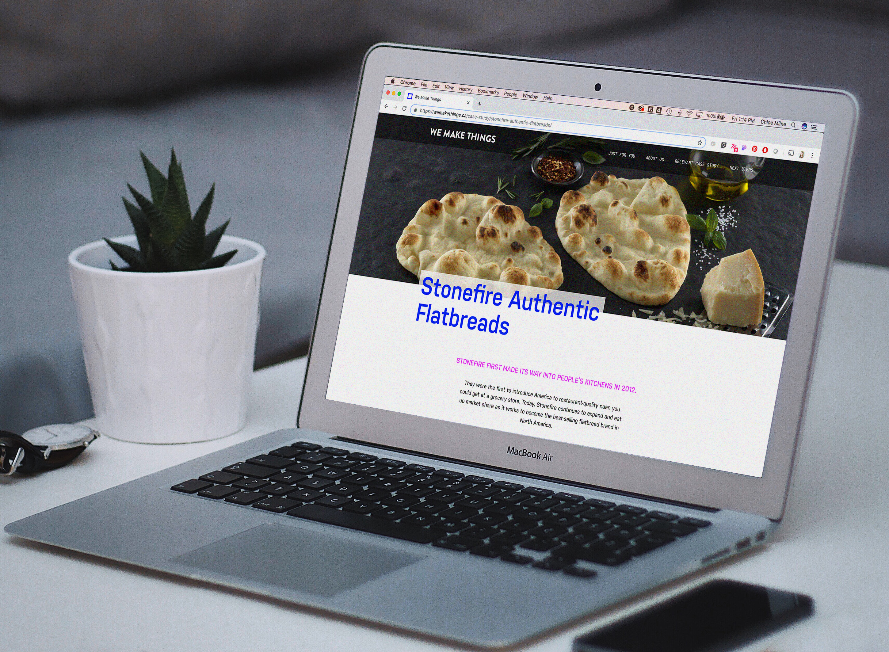
Below is a photo of one of our case studies featured on the pitch site.
Since publishing this project, WMT launched their agency website, which you can find here. More photos & details about this project to come!